INDUS
A new brand for reaching out to new Canadians.

Business Challenge
Indus Community Services (formerly India Rainbow Community Services of Peel) is a non-profit organization founded in the 80’s by the Indo-Canadian community. Their purpose is to help new South Asian immigrants overcome their settlement challenges by providing educational, social, health and employment related services.
With increased funding and support, the organization was growing and wanted to target a wider range of people, but their plan to grow hit a glass ceiling: the brand’s deep cultural connection and emotional value for the South Asian community was becoming a barrier to their future growth.
Misleading Perceptions were leading to a loss of relevance. ‘India’ as part of the brand name was misleading for immigrants from other countries, while ‘Rainbow’ as part of the brand name, affiliated with the LGBT community. The brand name ‘India Rainbow Community Services of Peel’, was also causing a road block in the expansion plans.
Strategy
For most clients and members of the organization, a South Asian name was a matter of pride. Therefore, more than 50 name options were created, which had universal acceptance but were also relevant for the South Asian community. With a final shortlist, focus group discussions were conducted with all stakeholders, including clients, members and agency partners who were from different ethnic groups to understand their cultural and religious sensitivities towards the new brand name.
Solution
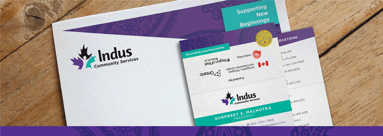
Indus, a name based on an ancient civilization, which represented a community of people, with strength and perseverance, who overcame many challenges and built a new life for themselves. A new logo and complete brand identity was strategically devised, capturing the both Canadian and the brand’s values.
A strong visual device of the untied knot, was created to serve as a metaphor for guidance and support provided by Indus in a members difficult time of transition. The new brand identity was extended to all creative elements, along with a visual style guide to help maintain brand consistency moving forward.